Six months ago, I began the search for the person who created the iconic cover art for Frank Sinatra’s 1955 concept album “in the wee small hours”. A friend was producing an album, and wanted something similarly evocative for its cover. The cover is a painting, deceptively simple, but able to precisely reflect the mood of a not so simple record. The album’s ballads, Sinatra’s unashamed and heartbreaking message of crippling loneliness, insomnia, lust and regret, is arranged in a devastatingly effective suicidal manner, using a small ensemble of somber woodwinds and celesta. A feeling of scary deep night is carried through with a distant, distracted piano, lazy horns and sleepy bells chiming almost reluctantly across a dreamy sound scape. Sinatra’s lyrical delivery is as if seems he is trying to convince himself of something, a fatal need carrying the weight of intense personal history, transcending his own spirit. The album is a testament to music as an artform, tender resignation at every turn, songs so majestic they might have been sculpted. The accompanying cover art represents a brooding, pensive Sinatra against the backdrop of an eerily deserted night-time streetscape, streetlights receding into the background, awash in the aqua and black hues of suicidal depression. Both album and album cover are annihilating meditations on heartbreak and desolation, the record sustaining its mood for its entire length (Elliot Smith did it later, wrote entire albums to open your veins to, but Sinatra did it first), the painting so exceedingly representative of all this as to seem almost inconceivable.
I don’t know anything about record album art and immediately became frustrated when googling keywords didn’t instantly supply me with the pertinent information, realizing that artists must have been record company slaves, contracted to them and not necessarily credited for their work.
When I finally discovered the artist’s name, I was ecstatic to learn that the elusive artist was not elusive at all. Rather, he was implausibly prolific with an almost unfathomably prodigious body of work. Further research informed me that he was considered the “father of the record album”, that he basically created the record album cover. Additionally, his body of work was so extensive and so awe inspiring that Taschen had a high end, newly published collection of his work. Best of all, Alex Steinweiss was still alive and well. I could contact him directly.

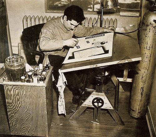
Alex Steinweiss was born in Brooklyn in 1917, his father, a women’s shoe designer from Warsaw, and his mother, a Latvian seamstress, emigrated to the Lower East Side of Manhattan, eventually settling in Brighton Beach. Alex went to Parsons on scholarship, and after graduating, worked for the Viennese poster designer Joseph Binder, whose flat color and simplified human figures influenced his own work. During World War II, Mr. Steinweiss became Columbia’s advertising manager and after the war, was introduced to an innovation that Columbia was about to unveil: the long-playing record.
In 1939, the record cover was blank, brown paper, book-like packages containing multiple 78 r.p.m. discs. In 1948 Columbia presented the LP format, with the advantage over the 78 rpm album of increased capacity. A symphony on 4 x 78 rpm records could now be engraved on a single long playing disc. The new medium did not need the fat, heavy albums, it needed a simpler sleeve. The standard sleeves for 78 RPM records were made of lightweight Kraft paper, folded and glued, with a strip folded inside the sleeve. If this method was applied to sleeves of the new LP record, it could damage the vinylite.

Columbia asked Steinweiss to design a cover specifically for a single Long Playing Record, and was on his way to revolutionizing the music industry. His first record cover made a huge splash. It was for a collection of songs by Rodgers and Hart performed by an orchestra, and featured a high-contrast photo of a theater marquee with the name of the album in lights. Within months, record sales had increased by over 800%. Steinweiss had the original patent for what became the industry outer packaging standard, but as a Columbia contract employee, he had to waive all rights to to the innovation.
“I love music so much and I had such ambition that I was willing to go way beyond what the hell they paid me for. I wanted people to look at the artwork and hear the music.”.
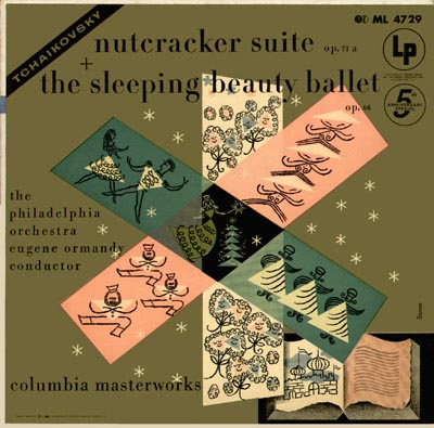
At age 23, Alex Steinweiss designed the world’s first ever album cover, launching the golden age of album design with his modern, elegant illustrations that revolutionized the way records were sold. Over three decades, Steinweiss made thousands of original artworks for classical, jazz, and popular record covers for all the major labels, for musical luminaries such as Louis Armstrong, Duke Ellington, Igor Stravinisky and Benny Goodman. He also designed logos, labels, even his own typeface, “the Steinweiss Scrawl”, a laudable leap for a boy from Brighton Beach who just wanted to do justice to Stravinsky and Rachmaninoff, Gershwin and Rodgers & Hart…all the music he loved.

His revolutionary idea transformed the packaging of music by making it no longer just about the audible experience, there was now a physical object to be coveted and collected. He approached them like miniature posters, bold and modern designs with vivid and eye catching graphics. He also used creative typography, the key information incorporated into the overall design. He changed the way musicians expressed themselves both visually and acoustically. Steinweiss favored metaphor to literalism and portraiture, often using collages of symbols against stylized backdrops, the large square format a perfect size for a piece of graphic design. Until the arrival of the CD format in the 1980’s the LP would be the main format, and the LP cover the main format for art work.


The record album “sleeve” proved to be almost as important an innovation as the record itself, presenting the consumer with an aesthetically pleasing and informative package. Sleeve liner notes provided a great resource for auto didactics (I loved liner notes, still annoyed by the casualness with which record collections taken a lifetime to accrue, can be stored on something the size of a Pop Tart and accessed at the flick of a switch). Without Alex Steinweiss’ novel idea of putting illustrations on the covers of records, there would be no Velvet Underground banana, no Nirvana swimming baby, no famous crowd adorning Sgt. Pepper, no Parallel Lines no Sonic Youth washing machines, no epic brouhaha over Kanye West’s George Condo–arted album cover. I had to talk to this guy.
Perusing the NY times Wednesday, I saw Alex Steinweiss’ obituary. The guy I had spent 6 months tracking down and obsessing over, died before I had the opportunity to contact him. He was 94.

